How I Plan & Design Websites
Before I write a single line of code or pick a color, I spend time really understanding who will use the site and what they need from it. I believe good design happens when you put real people at the center of every decision.
Here's how I approach each project—from that first "aha!" moment to a polished site that actually works for everyone who visits it.
1. Getting to Know the Users
I start every project by asking lots of questions. Who's going to use this site? What are they trying to accomplish? What frustrates them about similar sites they've used before? This detective work shapes everything that comes next.
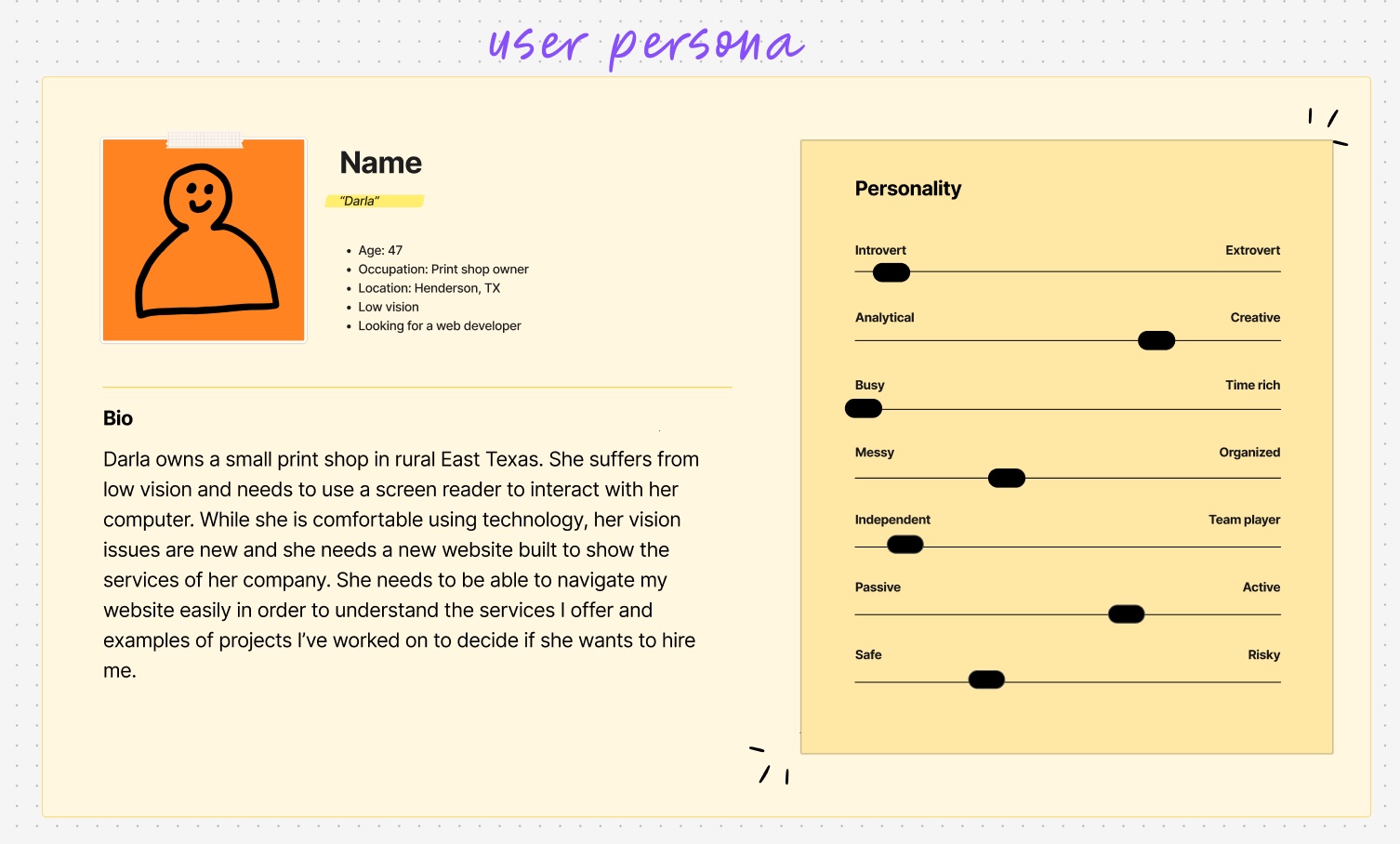
- User personas - I create detailed profiles of the real people who'll use the site
- Competitive research - I explore what's already out there and spot gaps
- Stakeholder conversations - I dig into business goals and any constraints
- Content inventory - I figure out what information needs to live where
Why this matters: When I understand what users actually need, I can design something that genuinely helps them instead of just looking pretty.
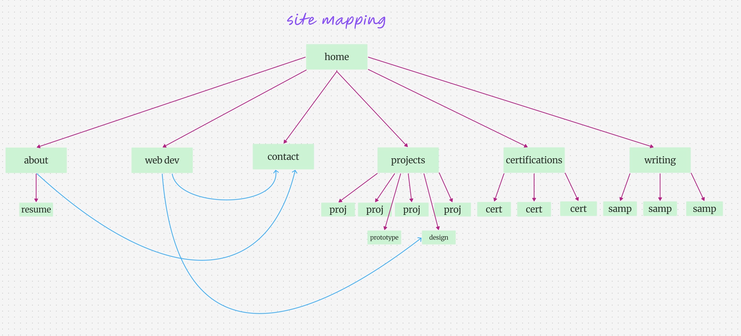
2. Organizing the Chaos
Once I know what users need, I figure out how to organize everything in a way that makes sense to them—not just to me. This is where I map out how people will actually move through the site.
- Site mapping - I sketch out how all the pages connect to each other
- User journey mapping - I trace the paths people will take to complete tasks
- Content strategy - I decide what information goes where and why
- Navigation planning - I create menus that actually make sense to real humans
This might sound boring, but it's where the magic happens. Good organization means people can find what they need without getting frustrated and leaving.
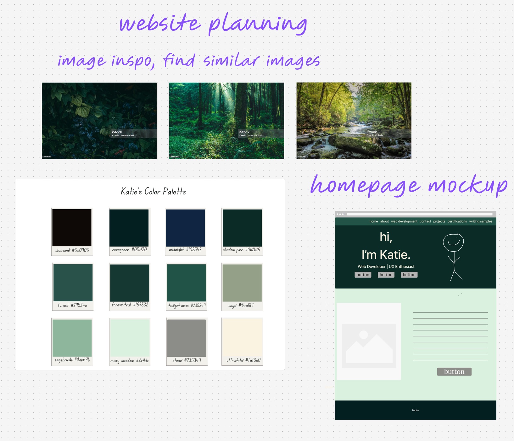
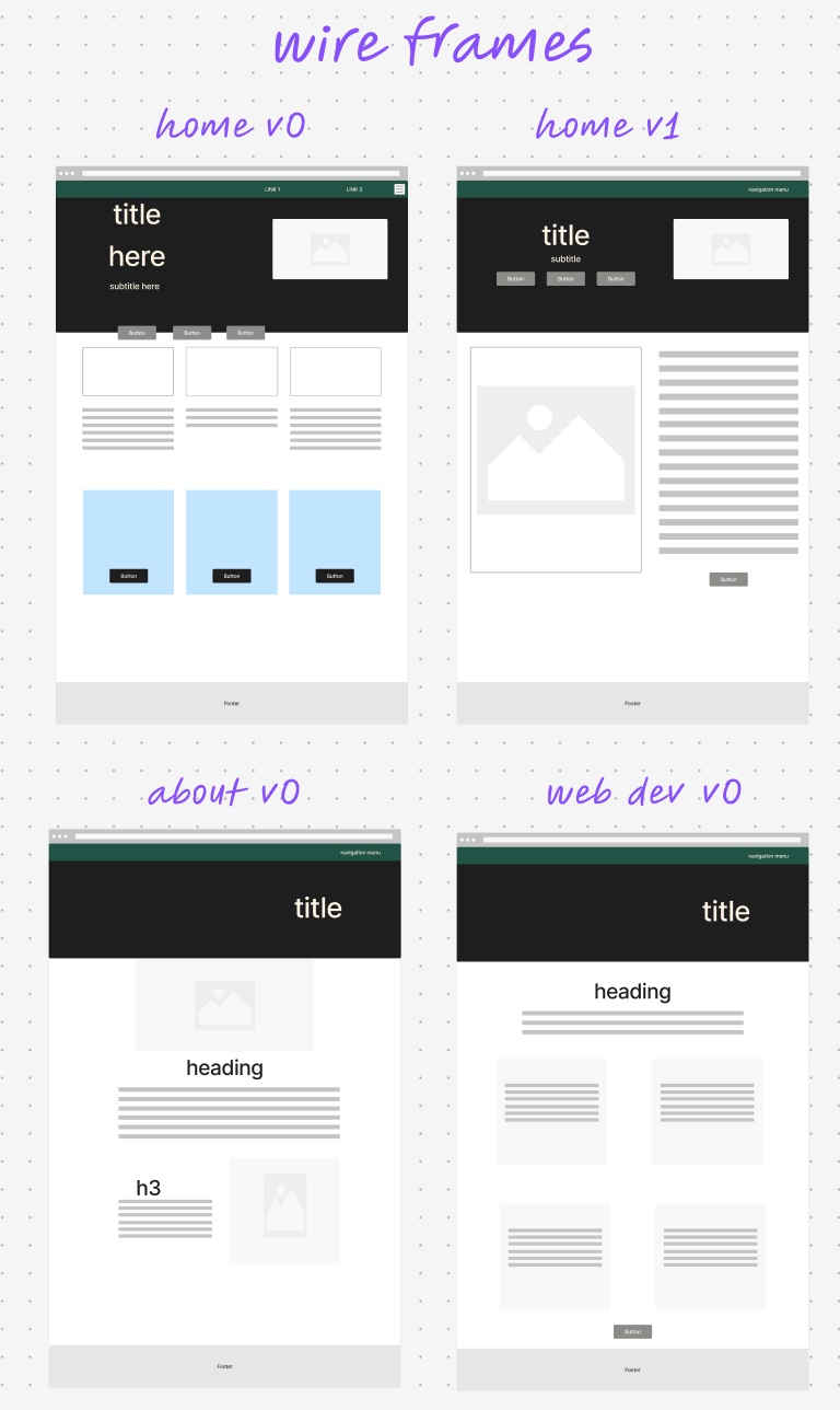
3. Sketching the Skeleton
Here's where I get my hands dirty with wireframes—basically rough sketches that show where everything goes without worrying about colors or fancy graphics yet. It's like building the frame of a house before decorating.
- Layout exploration - I try different ways to arrange content and see what works best
- Interactive prototyping - I create clickable wireframes so people can "test drive" the flow
- Mobile-first design - I start with phones and work my way up to bigger screens
- Accessibility planning - I make sure screen readers and other assistive tech will work perfectly
Mobile-first thinking: If it works on a tiny phone screen, it'll work everywhere. Plus, most people are browsing on their phones anyway!
4. Making It Beautiful & Usable
Now comes the fun part—adding color, choosing fonts, and making everything look polished. But it's not just about making things pretty; every visual choice has to serve a purpose and help users accomplish their goals.
- Design system building - I create a consistent set of components that work together
- Color psychology - I use colors strategically to guide attention and create the right mood
- Typography hierarchy - I make sure text is readable and creates a natural flow
- Accessibility testing - I verify that colors have enough contrast and everything works for users with disabilities
The goal is a design that looks great but also feels intuitive. When someone lands on the site, they should immediately know what to do next.
What Drives My Design Decisions
Every choice I make comes back to these core beliefs about what makes a website truly work for people.
Everyone Should Be Able to Use It
I design for people who use screen readers, have vision differences, or navigate with just a keyboard. When sites work for everyone, they work better for everyone.
Mobile Isn't an Afterthought
I start with the smallest screen and work my way up. If the core experience works on a phone, everything else falls into place.
Keep Improving Based on Real Use
I watch how people actually use the sites I build and keep tweaking based on what I learn. The best designs evolve over time.
Speed Matters
Nobody wants to wait for a slow site to load. I optimize everything so pages load fast, even on slower connections.
It Never Really Ends
Here's the thing about good design—it's never actually "done." After a site launches, I keep watching how people use it, gathering feedback, and making it better bit by bit.
I run usability tests with real users, check that accessibility features are working well, and monitor site performance. When I spot something that could work better, I fix it. That's how sites stay fresh and useful as both technology and user needs evolve.